Honesty is the best poetry
I’ve written elsewhere about “PowerPoint Best Practices” and why slide design can make the world a happier place. Images are like poems: their economy is such that they immediately engage our affective (versus cognitive) domain – and affect is hugely influential in learning and knowledge retention. I was briefly obsessed with imagist poetry as a teenager: “that which presents an intellectual and emotional complex in an instant of time”. (It left its mark.)
The same disciplined simplicity is at the heart of the best and most effective use of beautiful/disturbing/thought-provoking/unexpected visuals accompanying a presentation. (PS: Check out this anthology if you want to learn more about imagism)
“Sounds good, but how can I visually translate MY ideas?” (especially an image that is compelling, novel and adds value)
It’s a fair question. Most academics are trained to frame our ideas and concepts in words, not pictures. Yet words and pictures are both just symbols. For example, this slide deck for a full day workshop on advanced practice in Motivational Interviewing is approximately 80% images – used as placeholders for each of the practice-based activities I facilitated throughout the day.
In short: think about how you would define or translate the one key idea behind what you are trying to communicate. It is more than an excercise in finding pretty pictures – ruthless simplification forces us to reflect on the essential. That which we intend to be most memorable. This can only be a good thing for both presenter and audience!
Major Caveat: Visual communication is especially critical in relation to numeric data. Twenty years ago I never thought of data visualization as a career path, yet these modern-day dowsers are crucial to our understanding of the digital ocean. And that’s a whole other conversation: check out Big Data Science on Twitter. I am a rank amateur compared to what these people do.
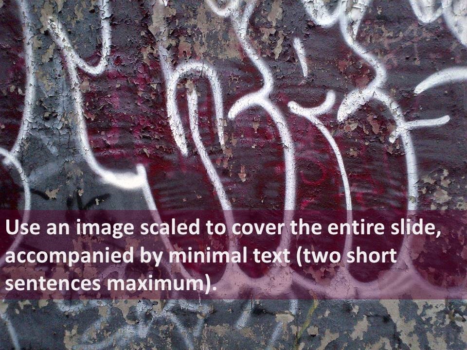
If I were presenting this article to you, here is my slide:

(Honesty is the best poetry, Queen St West, Toronto, Canada )