The good, bad and ugly of PowerPoint
Slideware 101: Tips and Resources
We’ve all been there: the uncomfortable chairs, the slightly darkened room, and slide after slide after slide. Each one identically bullet-ed, punctuated by the occasional graph and the speaker stating, “I know that you can’t read this, but…”.
The almost ubiquitous use of slideware has rigidified knowledge communication, and the sad part is that somewhere buried in the bullet points and boredom is someone’s singular message, lost. Not only that, sometimes the consequences of information presented poorly can be devastating.
Edward Tufte, a Yale University Professor Emeritus and visionary in information design and data visualization, wrote an influential essay – posted online – pointing to the use of PowerPoint slide decks in NASA engineering briefings as a contributing factor in the 2003 Columbia space shuttle disaster. In their report, the Columbia Accident Investigation Board concluded that “the distinct cognitive style of PowerPoint reinforced the hierarchical filtering and biases of the NASA bureaucracy during the crucial period when the Columbia was injured but still alive”. The take-away? Templates that structure information into bullet points can obscure nuance and interrelationships within and between knowledge domains.
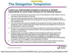
The way I see it, it’s not slideware that’s the problem, it’s how it is used. Done well, visuals (whether video or static images) can add impact and interest to a presentation. But the design tools and templates of PowerPoint et al. are generally used by folks who have never learned design. Thus we end up with…
You can check out the full article with more examples here.
I too have been guilty of multitudinous slideware sins, and found redemption in Garr Reynolds’ Presentation Zen, and accompanying resources and slide decks. I especially like the PowerPoint “Before and After” demos to illustrate how good design can transform our visual communication.
In a nutshell:
Simplicity is key to good design. Images trump words. Fewer words are better than a lot of words.
Here a couple of my own PowerPoint makeovers, inspired by Reynolds’ work.
This slide attempts to summarize (via text) the information and context that should be delivered in a narrative elaboration of the simplified (after) slide
This was from a slide deck on presentation skills, and offers a good example of how slides and handouts should be two different things
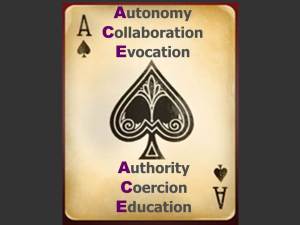
I was quite proud of this next slide, which had lots of text animations (shudder). The second slide conveys the “ACE” acronym via the image
Follow this link for more examples of PowerPoint Makeovers.


Pingback: PowerPoint Design Best Practice | educateria