

Making the world a happier place, one slide at a time
The vast majority of slideware is used as speakers’ notes. Probably because:
- It’s comforting to have what I’m going to say right there on a big screen, just in case I forget
- I’m inspired by images, but I frame my thinking in words. It’s easier to type a list of bullet points than it is to locate the one perfect picture that tells a story
- I’m not trained in graphic design or visual arts, so putting together clean and compelling slideware compositions doesn’t come naturally
- It can be hard to access high quality art and photography.
The work of Garr Reynolds and his Presentation Zen has been instrumental in my own PowerPoint makeovers (“The Good, Bad and Ugly of PowerPoint”).
In addition, tools like Haiku Deck offer a polished and visually compelling alternative to traditional slideware applications.
What’s the take-home message? What does it all boil down to? Here is my one-sentence “best practice” for slide design:
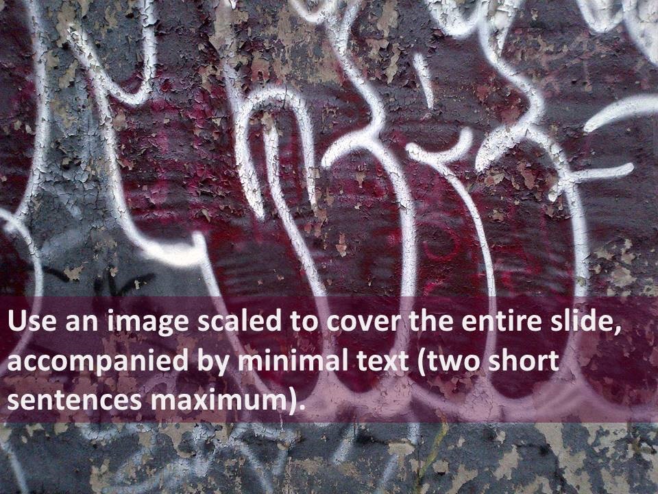
Imagine if every slide in every presentation looked this way? The world would be a happier place.
